About me
Portfolio
Other Projects
Contact
About me
Portfolio
Other Projects
Contact
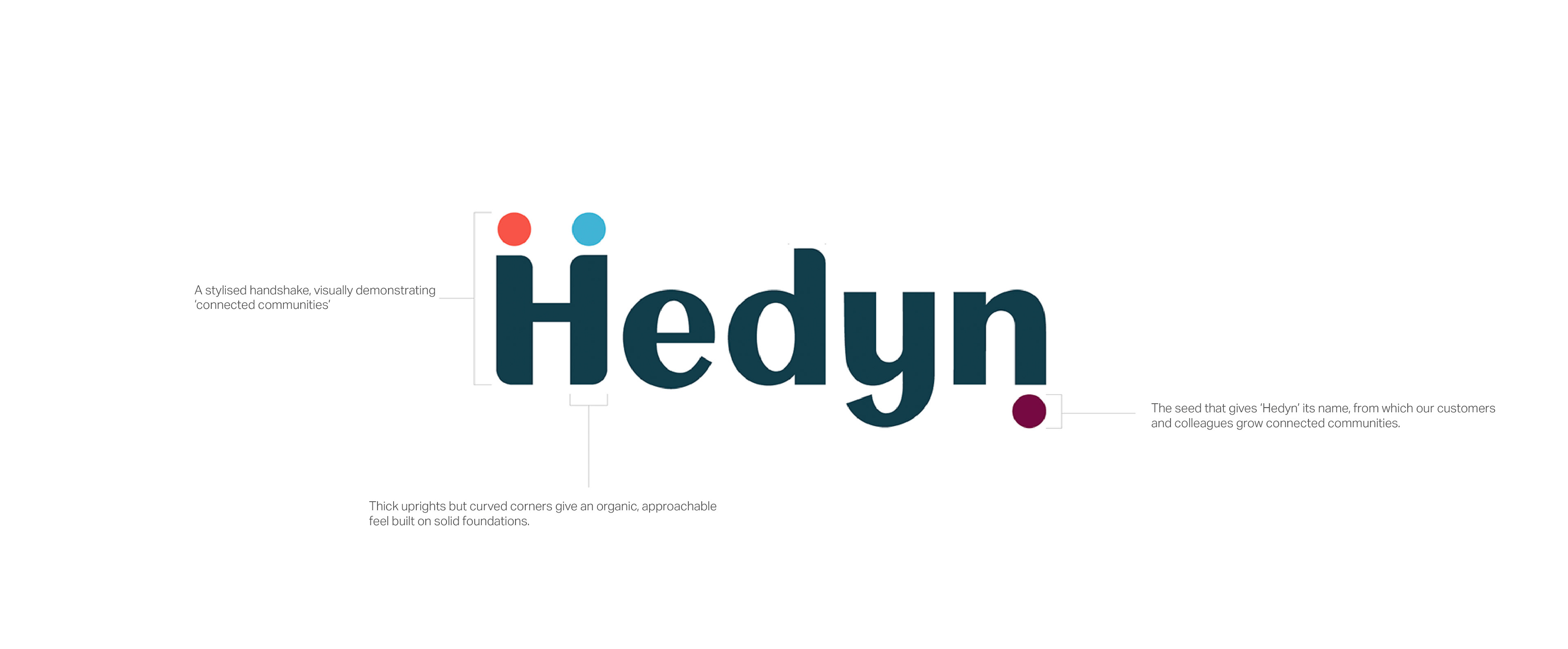
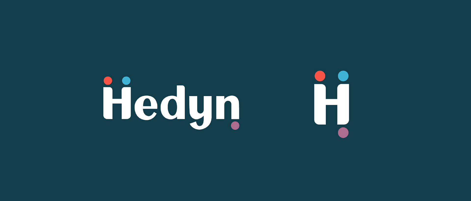
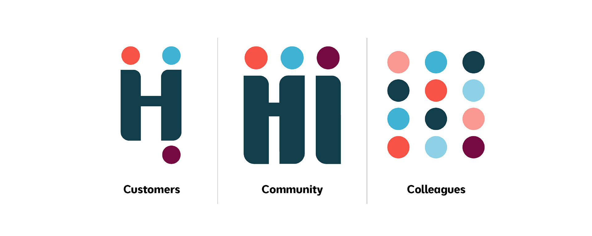
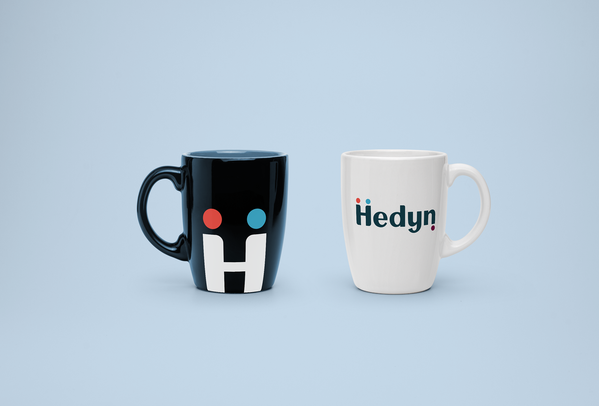
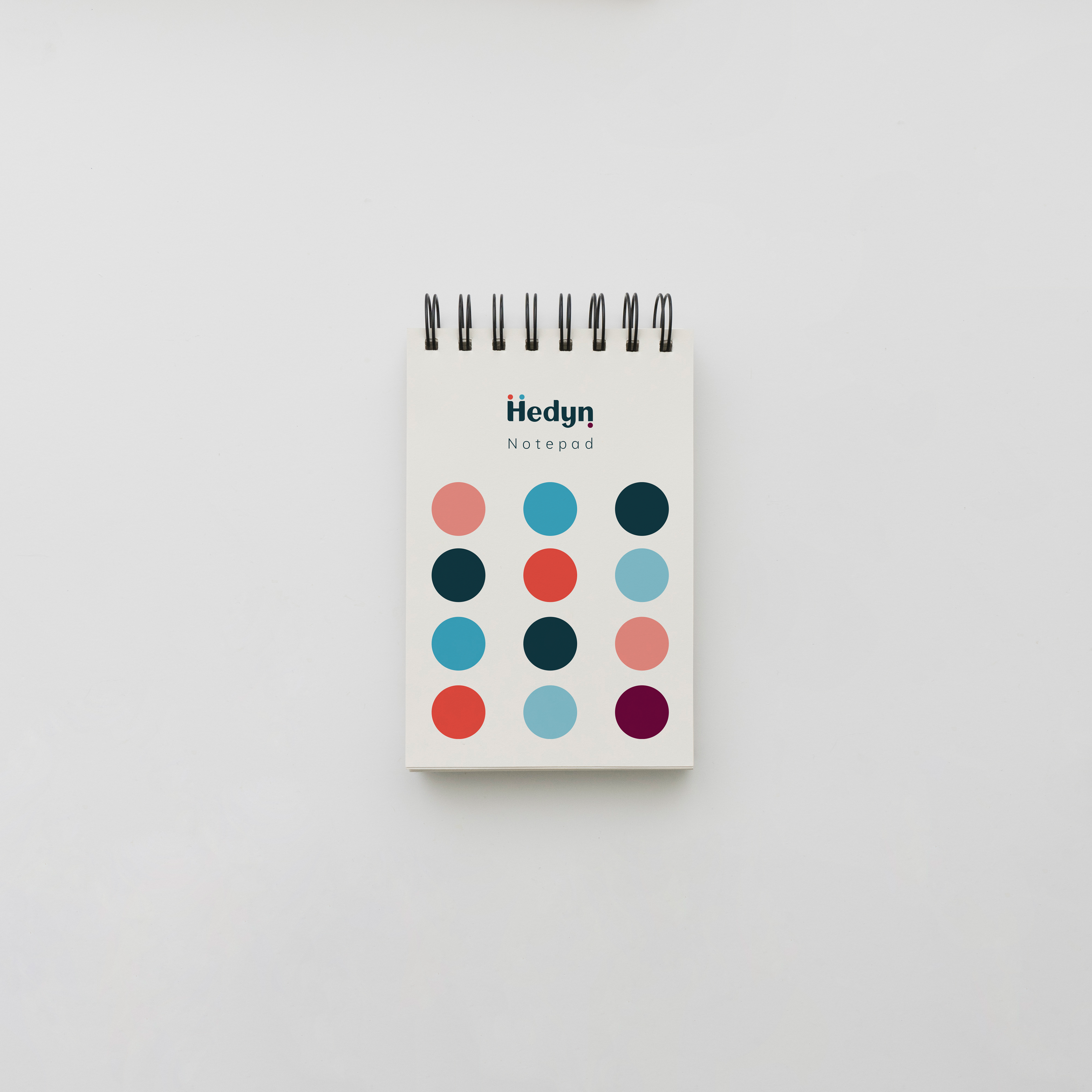
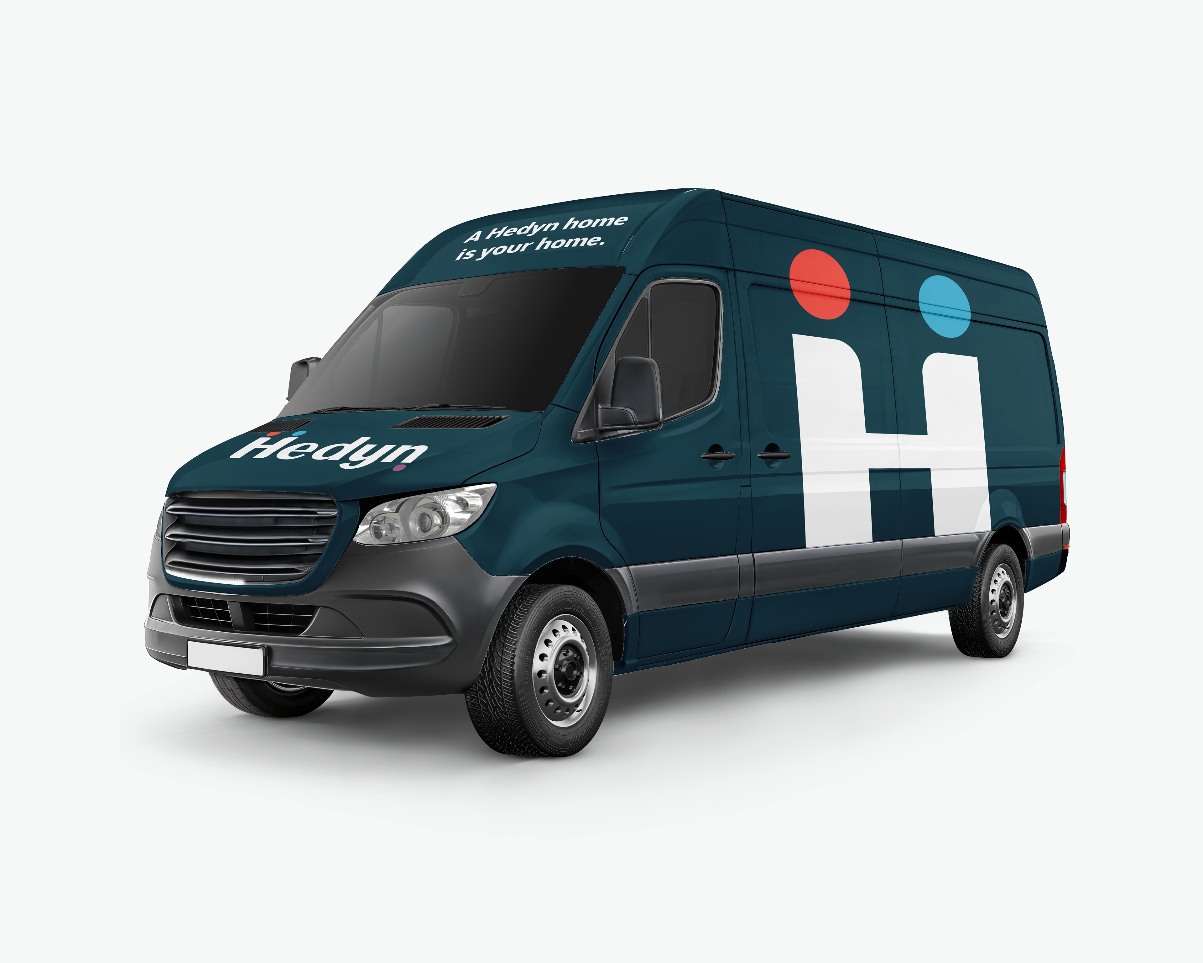
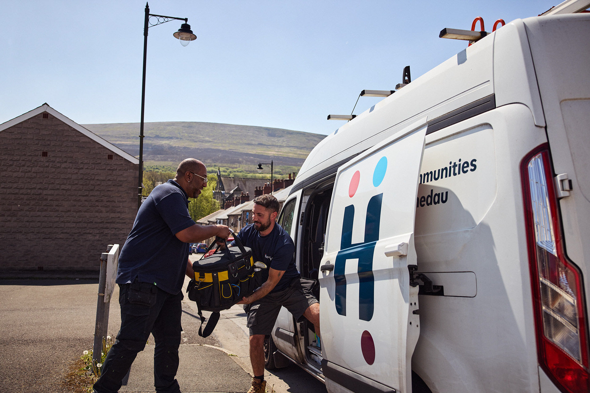
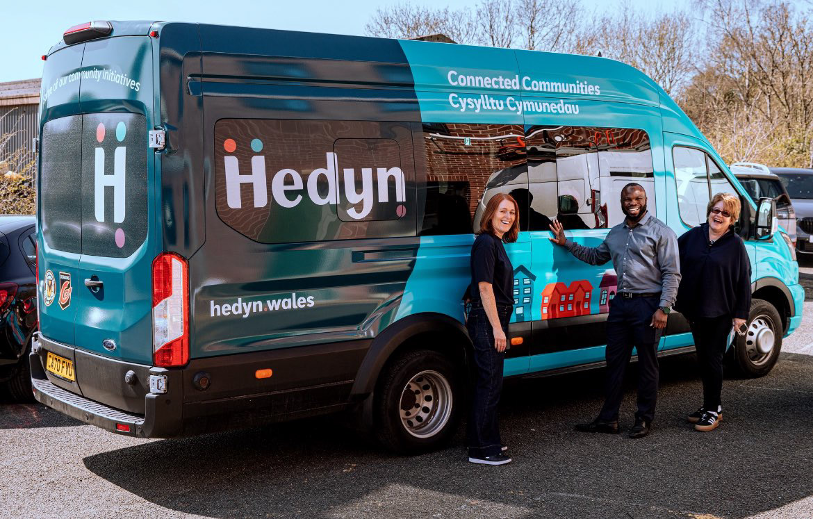
Hedyn - Brand Development
Branding for the merger of two Welsh social housing organisations.
You may also like
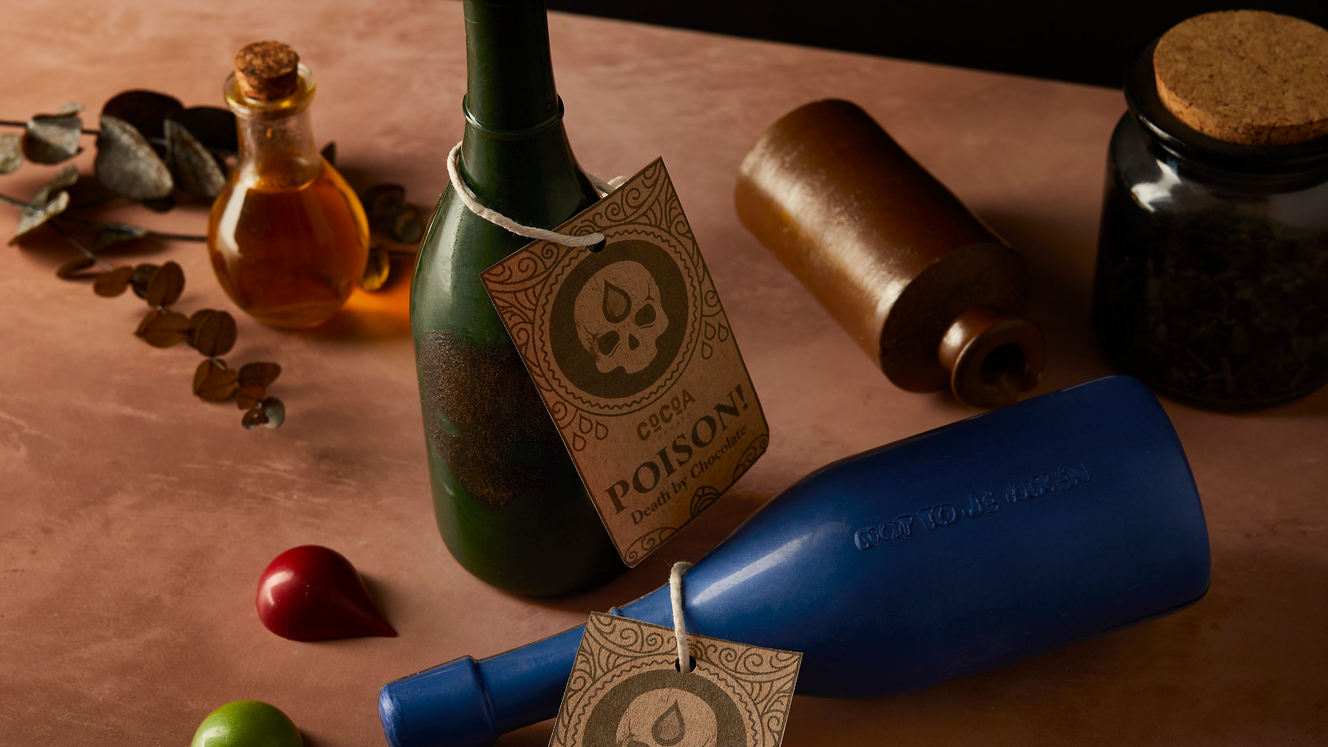
Cocoa Therapy - Halloween Packaging
2023
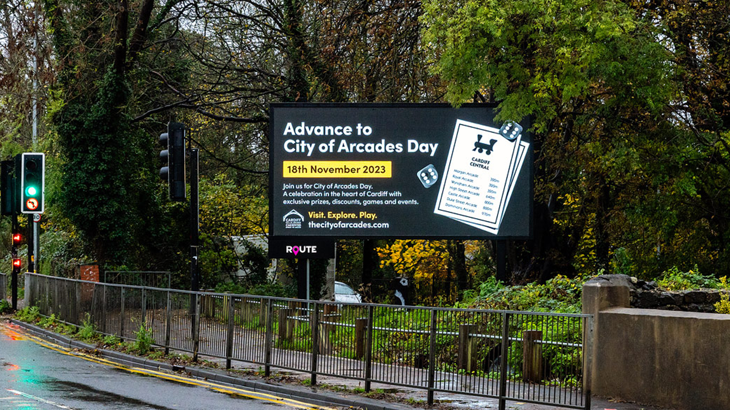
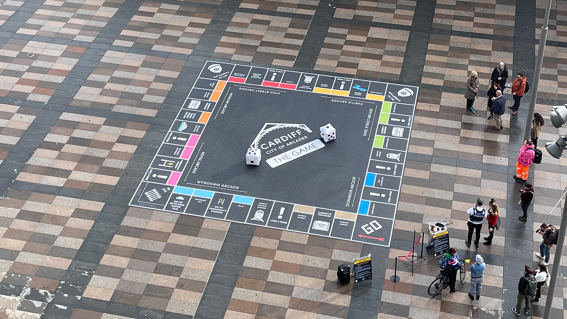
FORCardiff - City of Arcades Day Campaign
2023
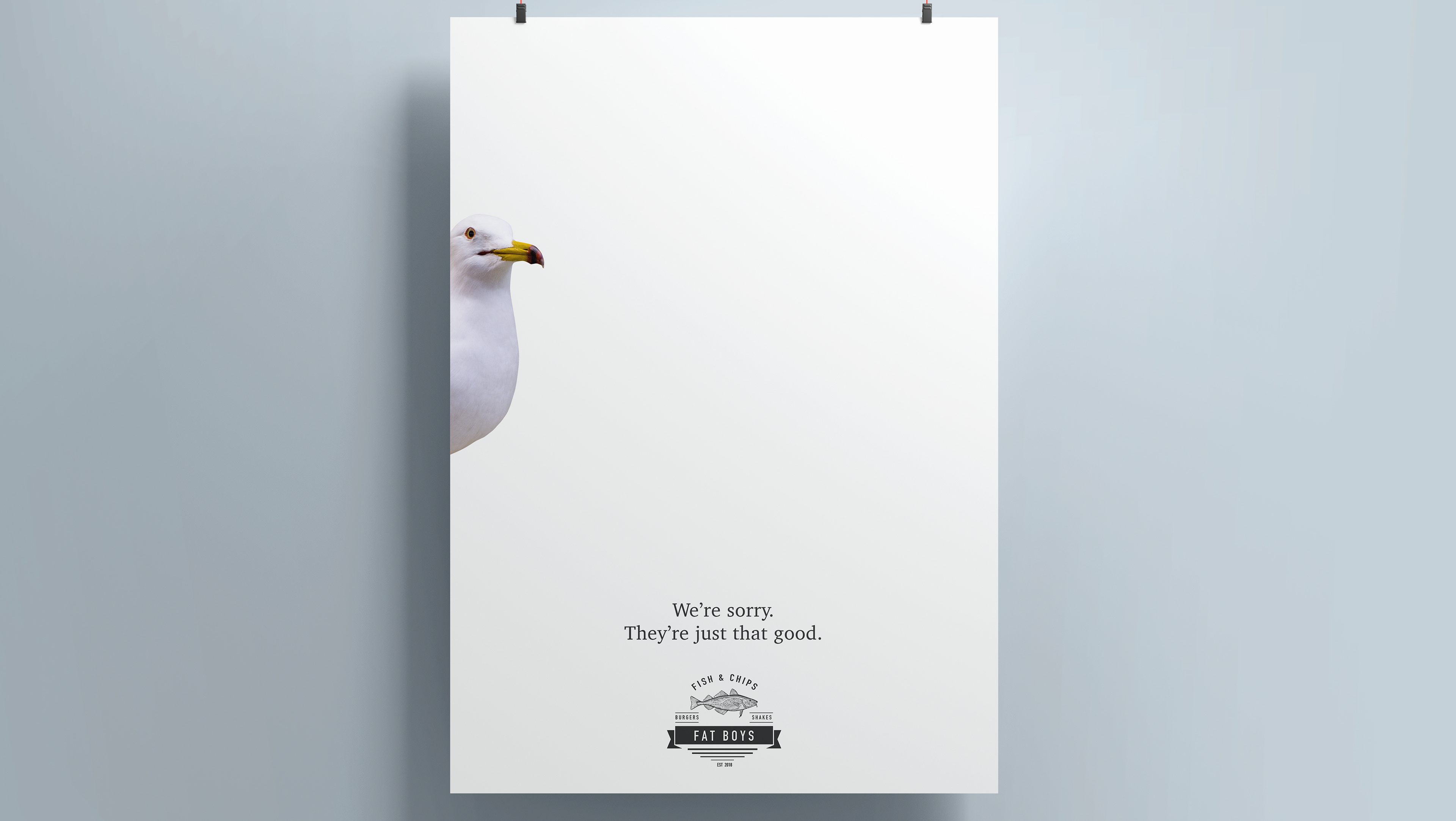
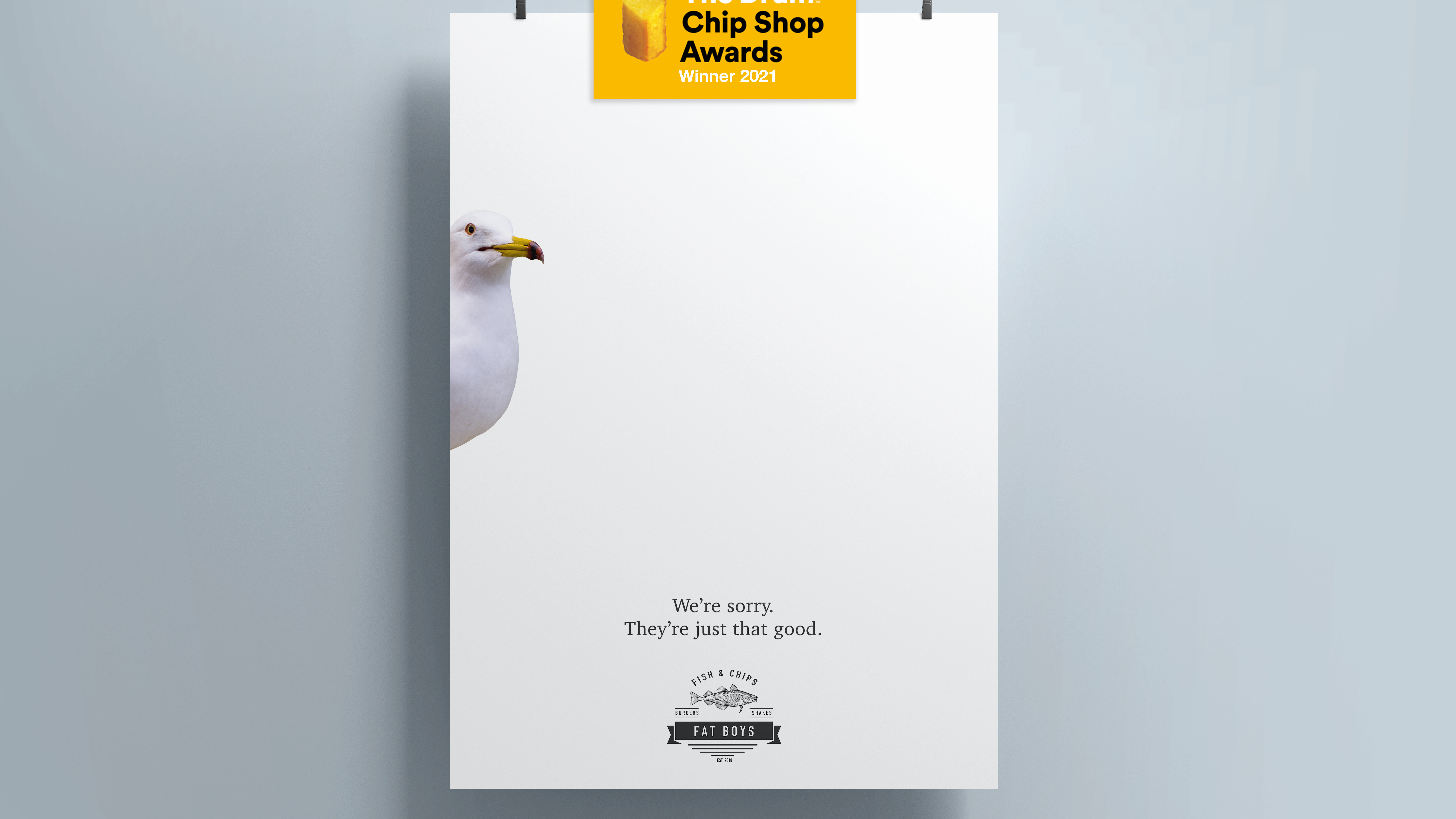
Chip Shop Awards - Advertise Chip Shops
2021
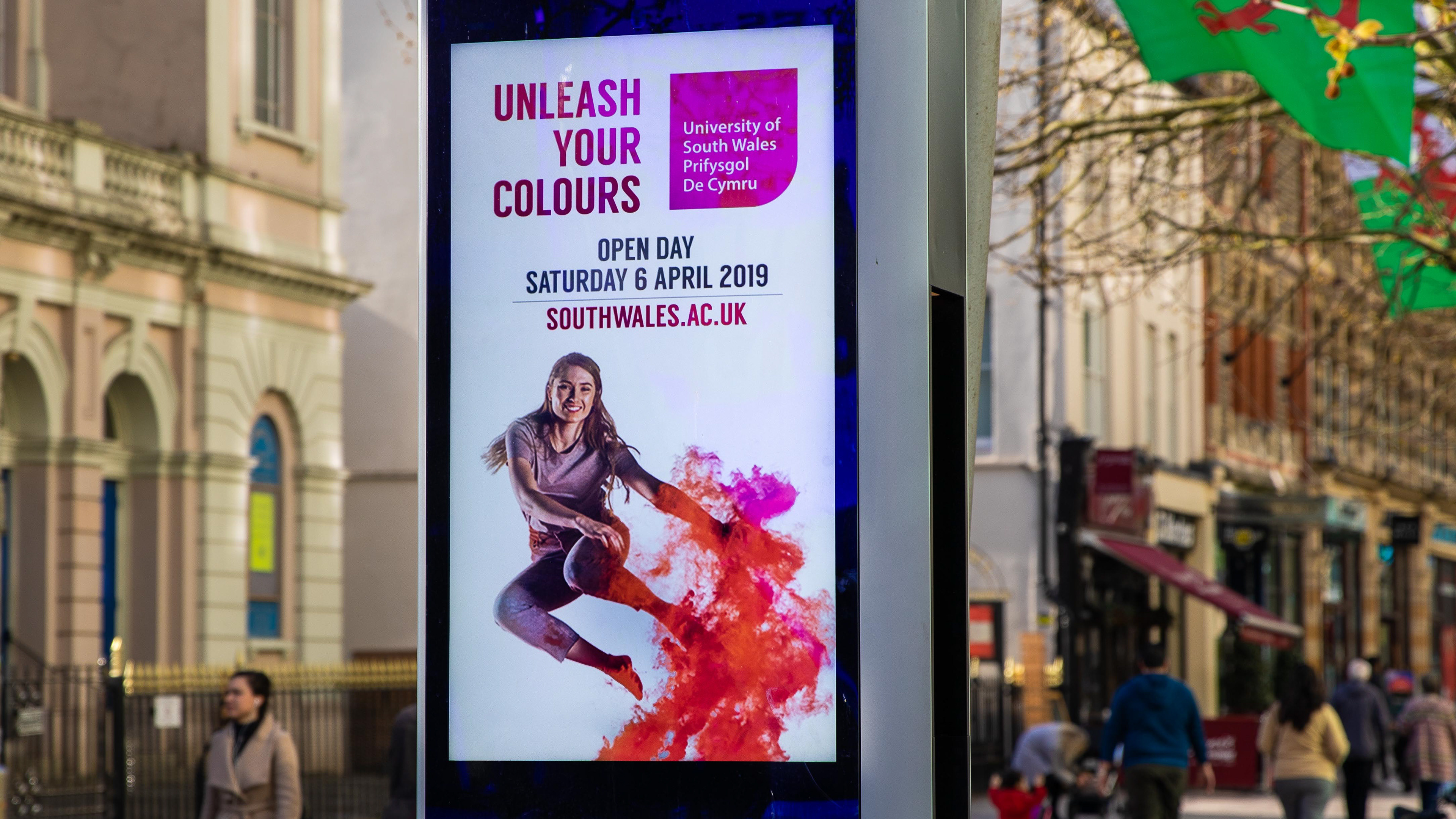
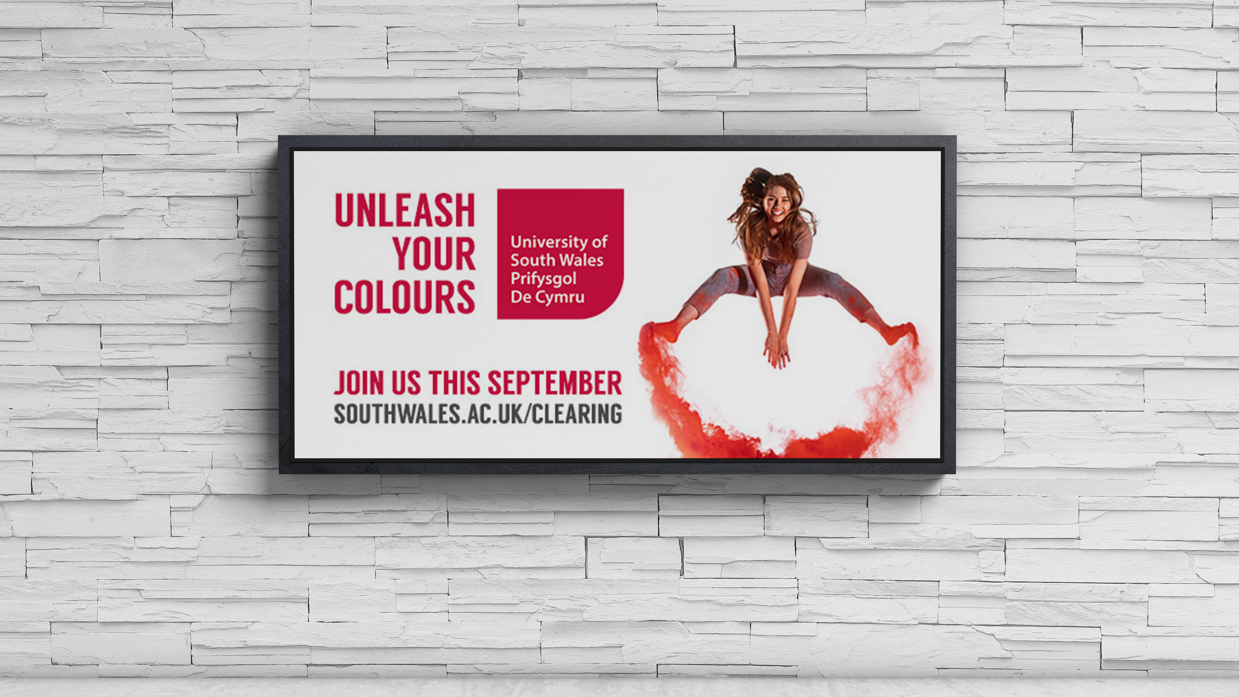
USW - 'Unleash Your Colours' Campaign
2019
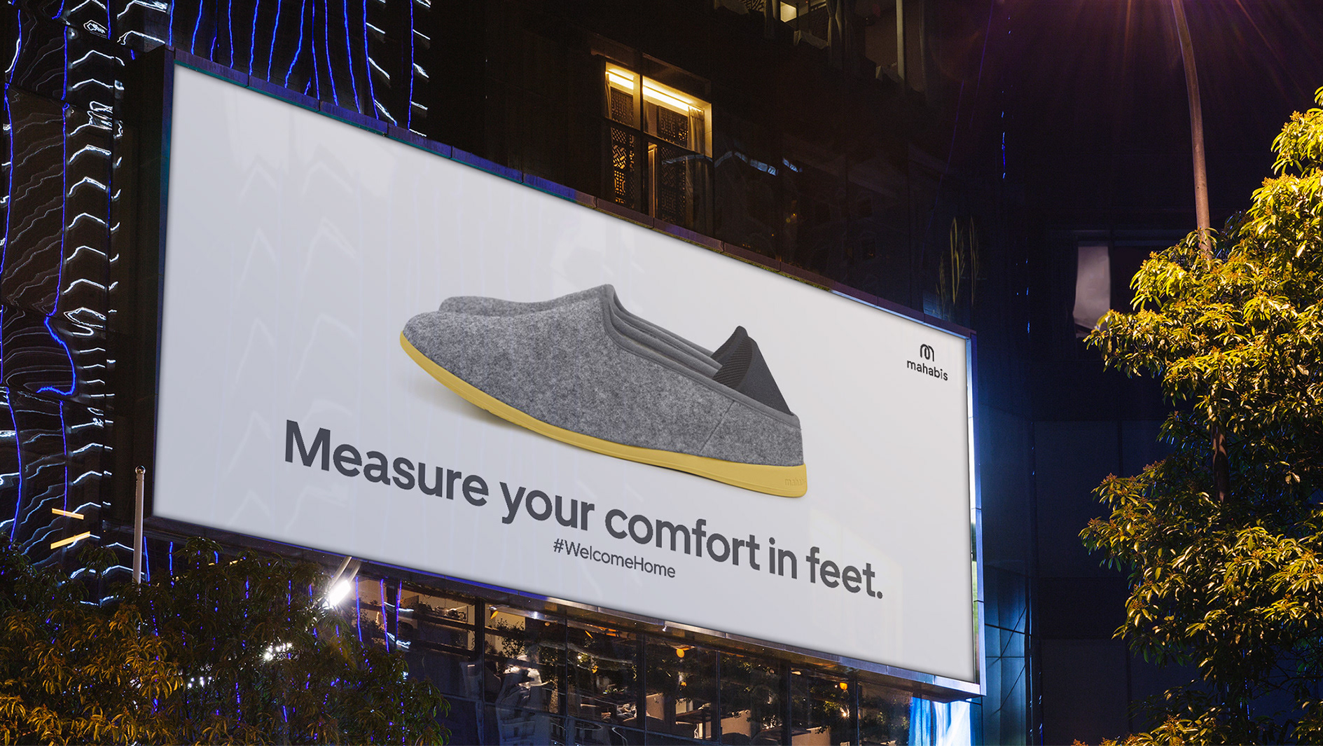
Spec Work
2025
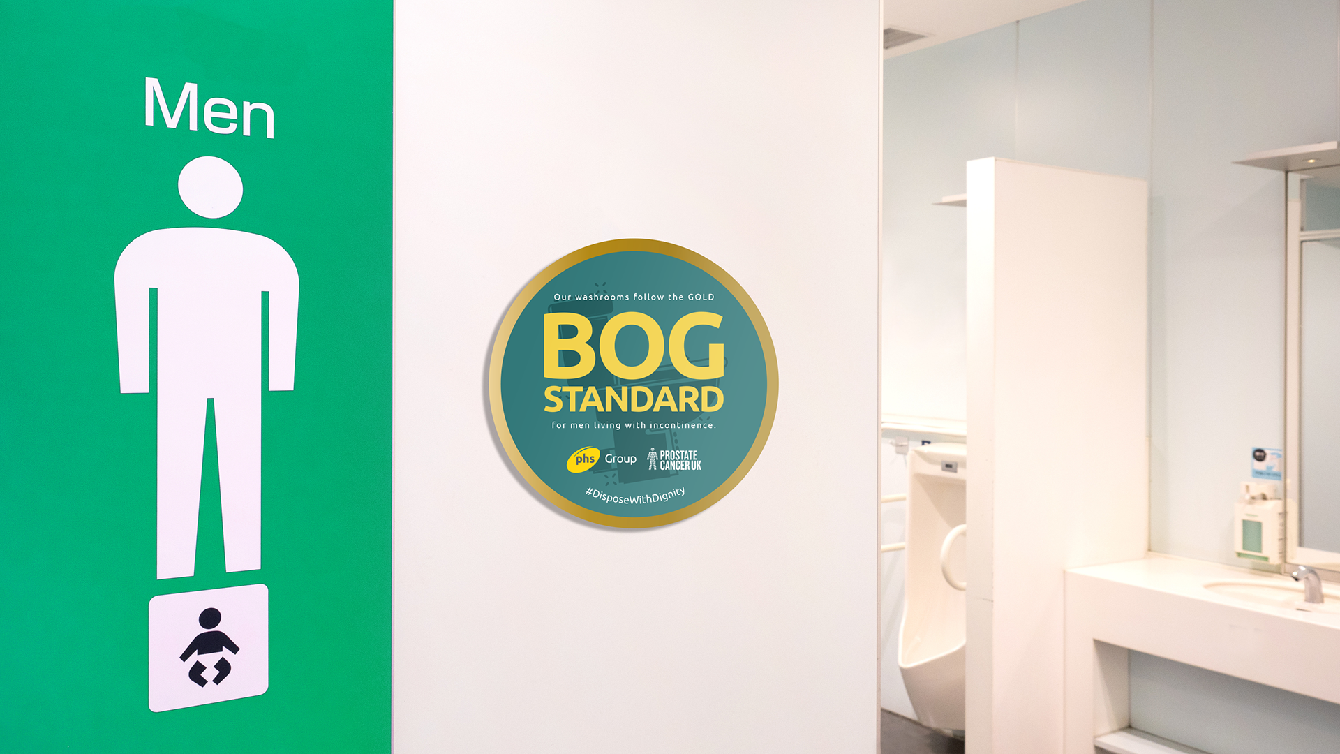
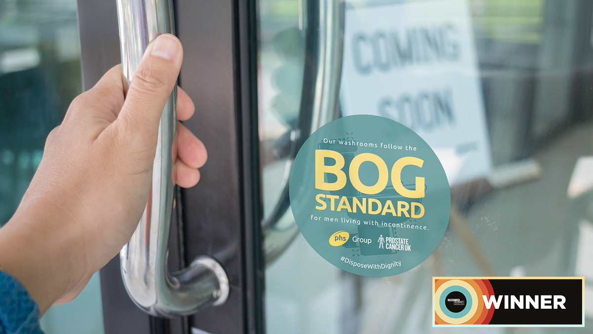
phs Group - Bog Standard Campaign
2025
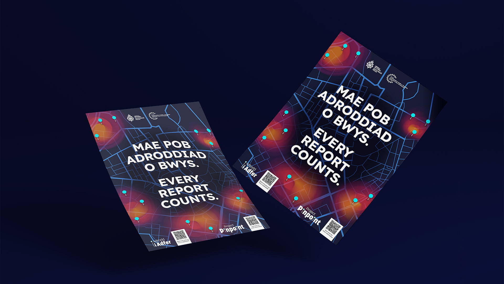
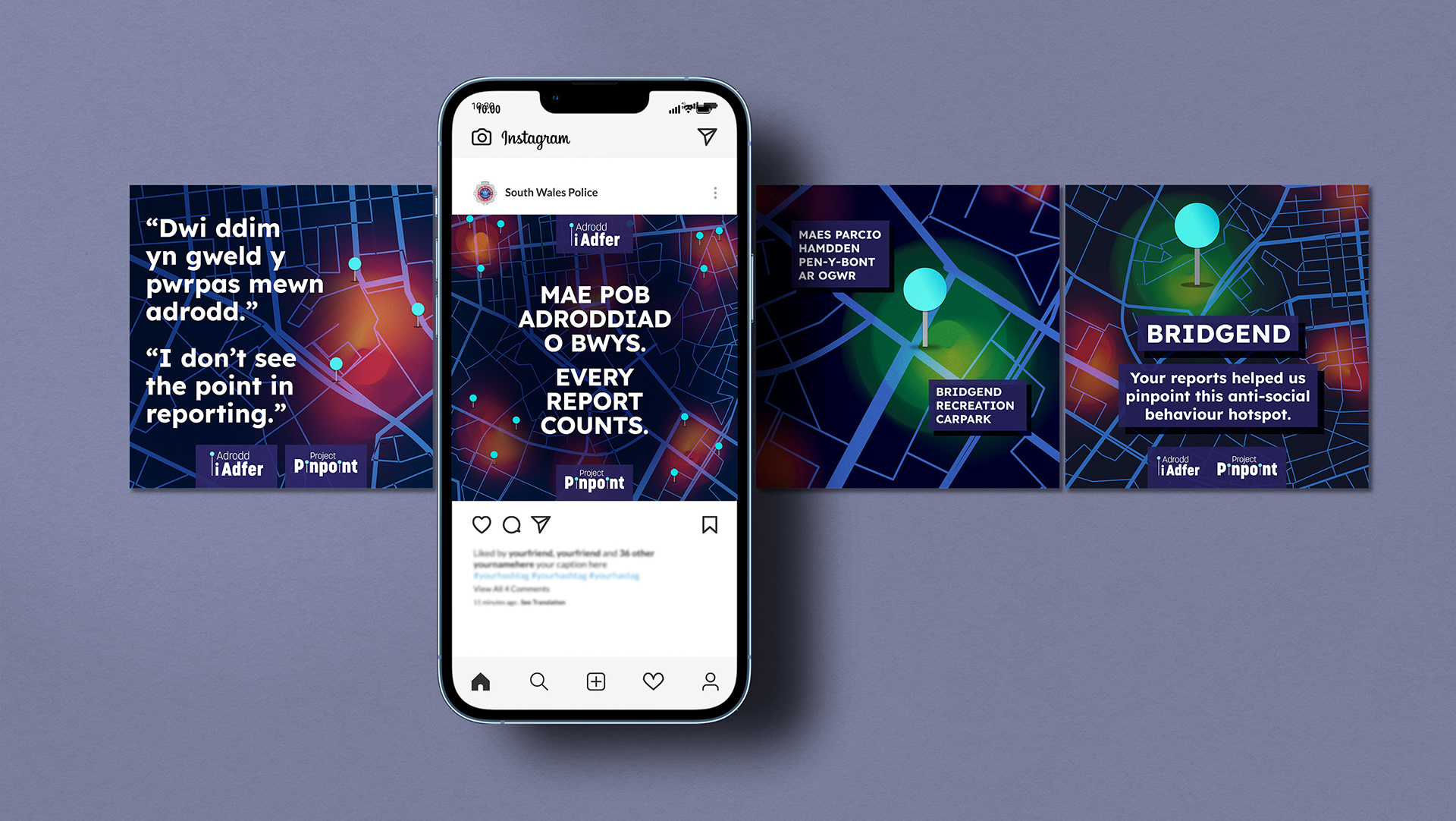
South Wales Police - Project Pinpoint
2025
National Adoption Service - 'Choose Family' Campaign
2021
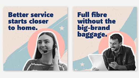
Broadband Independents' Day brand & social media
2026
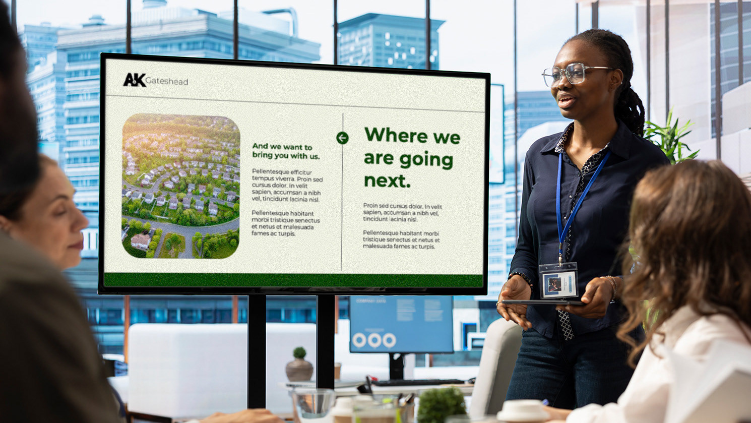
A&K Gateshead Branding
2026
↑
Back to Top